A Dot distribution map is also known as a Dot Density Map, these maps use dot symbols as a visual key to portray the data. These maps rely on visual representation to show spatial pattern.
http://www.census.gov/geo/www/mapGallery/2kpopden.html
Monday, November 21, 2011
PLSS maps
PLSS maps stand for Public Land Survey System. They are used to divide and describe land in the United States. These maps divided public land domains, which is land owned by the Federal Government, this is all for the benefit of the U.S. citizens. PLSS consists of several different surveys relating to different areas.
http://nationalatlas.gov/articles/boundaries/a_plss.html
Statistical Maps
http://slabbed.wordpress.com/2008/04/06/subsidy-for-dummies-who-think-the-insurance-industry-isnt-subsidized/
Wednesday, November 16, 2011
Propaganda Maps
Propaganda Maps tend to be more artistic in order to represent and affect public opinion and emotions rather than based off data like much of the other maps within this blog. This usage of spacial representation in an artistic way of a tool of manipulation is proven to be very powerful.
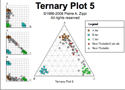
Triangular Plot
Triangular Plot is an analytical application that visualizes three separate values on a diagram in the shape of a triangle with three bivariate cross plots. The normalized space is where the mean and standard deviations are calculated. Outside of the triangle diagram are the negative values.
http://www.pazsoftware.com/Ternary5.html
Scatterplot
A scatterplot is a visual representation of statistically collected and analyzed data that is projected upon an X and Y axis. These maps are typically used to gather statistical variance between different coefficients.
http://regentsprep.org/REgents/math/ALGEBRA/AD4/scatter.htm
Windrose
A windrose is a visual representation of wind intensity and direction projected upon a Cartesian north south plane.
Subscribe to:
Posts (Atom)