Monday, November 21, 2011

DEM


DEM stands for Digital Elevation Model, this means it is a 3-D representation of a terrains surface. This type of map generally focuses on the earth's surface and everyone that is on it, without including plants and buildings.

http://rrsg.uct.ac.za/activities/activities.html

DOQQ


Produced by the USGS, DOQQ are digital areial images that are at a resolution of one meter. This is a picture of a color infrared in 1998.

http://www.lib.ncsu.edu/gis/doqq.html

Range graded proportional circle map


There are different types of range graded proportional maps, but circle maps are the most popular. They are the most important because they are easy to construct. From a symbol standpoint, a circle is the easiest to proportion. Also cirlces are a very good visual tool used that can be very stable from a graphing point.

http://go.owu.edu/~jbkrygie/krygier_html/geog_353/geog_353_lo/geog_353_lo11.html

Accumulative line graph or Lorenz curve


A Lorenz curve is a graph showing the bottom percentage distribution in proportion to the values. Often used with economics when looking at different income distribution.


Parrallel Coordinate graph

Parallel Coordinate graphs are a common way of showing high dimensional geometry in a visual manor. A background of parallel lines is drawn to show the set of points that form a n-dimensional space.The parallel lines are normally evenly spaced and run vertical.

http://servus.itn.liu.se/smartdoc/project_results/knowledge/MD-Viewer/summary.html

Index Value Plot

An index value plot simply means to depict the relatively of all values to an indexed value.

http://jn.physiology.org/content/96/6/3323.full

Similarity Matrix

Similarity Matrix are used in sequence alignment. They are used to show the similarity of two data point within a matrix of scores. A similarity matrix has to have the following five characteristics to be classified as a matrix, squareness, non-negativity, boundedness, reflexivity, and symmetry.

http://www.biomedcentral.com/1471-2164/8/353/figure/F5?highres=y

Correlation matrix


Correlation is one of the most commonly used techniques because it is so useful. A correlation is a single number that describes the degree of the relationship between two variables. A correlation matrix computes the computes the correlation of the columns of a matrix.

http://www.sunshineprofits.com/research/precious-metals-correlations-next-step-multi-market-analysis

Star Plots

A star plot is a graphical data technique for looking at the relative behaviors of all variables in a multivariate data set. A star plots consists of a sequence of spokes, radii, each spoke representing different variables within the data set. The data length has to do with the spoke length that is also relative to the multivariate data set.

http://emdsmaps.blogspot.com/2008_07_01_archive.html

DLG

A DLG is a Digital Line Graph, this is digital vector data representing cartographic information. DLG have a wide variety of information when depicting different geographic features such as boundaries, utility lines, and roads.

http://tahoe.usgs.gov/images/4ds/dlg_zoom.gif

Hypsometric maps


A hypsometric map is a map depicting the earth's configuration. This is done by using different elevations of contour lines, shading, or tinting. Above is picture of terrain being represented by with shading of different colors of different elevations and contour lines.

http://www.izera-darksky.eu/izera/izera-en.html

Cadastral Maps

Cadastral Maps is a comprehensive register of the metes-and-bounds of real property of a country. This includes the details of ownership, GPS points, dimensions, tenure, and the value of the property. Many different countries also use this type of survey as a title register.

http://www.spaceage.co.in/cadastral-surveys.php

Cartographic animations

Animation is defined as a graphic art that occurs in time, a dynamic visual statement. Although the improvement of technology has increased the use of animation in cartography, the technique is still getting over hurtles with GIS. Temporal and non-temporal are the two types of cartographic animations.

http://maps.unomaha.edu/cartographic/animation/Temporal/TempAnim.MOV

LIDAR

LIDAR is an optical remote sensing technology that often use pulses from a laser that measure different of a target illuminating the target with light such as distance. LIDAR stands for Light Detection and Ranging, this is often used in military context.

http://www.saic.com/geospatial/modeling/lidar-urban-modeling.html

Dot Distribution Maps

A Dot distribution map is also known as a Dot Density Map, these maps use dot symbols as a visual key to portray the data. These maps rely on visual representation to show spatial pattern.

http://www.census.gov/geo/www/mapGallery/2kpopden.html

PLSS maps

PLSS maps stand for Public Land Survey System. They are used to divide and describe land in the United States. These maps divided public land domains, which is land owned by the Federal Government, this is all for the benefit of the U.S. citizens. PLSS consists of several different surveys relating to different areas.

http://nationalatlas.gov/articles/boundaries/a_plss.html

Statistical Maps


A statistical map is a map where the variation in quantity of a factor such as population are represented in a geographic form, a dot map is a type of a statistical map. The map above is representing total number of claims in different areas.

http://slabbed.wordpress.com/2008/04/06/subsidy-for-dummies-who-think-the-insurance-industry-isnt-subsidized/

Wednesday, November 16, 2011

Propaganda Maps


Propaganda Maps tend to be more artistic in order to represent and affect public opinion and emotions rather than based off data like much of the other maps within this blog. This usage of spacial representation in an artistic way of a tool of manipulation is proven to be very powerful.

Triangular Plot

Triangular Plot is an analytical application that visualizes three separate values on a diagram in the shape of a triangle with three bivariate cross plots. The normalized space is where the mean and standard deviations are calculated. Outside of the triangle diagram are the negative values.

http://www.pazsoftware.com/Ternary5.html

Scatterplot


A scatterplot is a visual representation of statistically collected and analyzed data that is projected upon an X and Y axis. These maps are typically used to gather statistical variance between different coefficients.

http://regentsprep.org/REgents/math/ALGEBRA/AD4/scatter.htm

Windrose


A windrose is a visual representation of wind intensity and direction projected upon a Cartesian north south plane.

Nominal area choropleth map


Nominal area choropleth maps are choropleths maps that visualize nominal data such as percentages and ordinal numbers over a particular spacial area.

http://my.ilstu.edu/~jrcarter/Geo204/Choro/Tom/

Standardized Choropleth Maps


Standardized Choropleth maps use the ordinal progression of various classes from a spectrum of high to low and etc. In these maps the variable measured is standardized to help provide the information in an easier way to understand.

http://www.cdc.gov/pcd/issues/2007/oct/07_0091.htm

Unstandardized choropleth maps


Unstandardized choropleth maps do not have ordered classes. The various map variables are not ranked against one another hiearchally.

http://pubs.usgs.gov/fs/2005/3051/

Univariate choropleth map


A univariate choropleth map uses one determinate variable which is visually represented through a single shading choropleth scheme; ultimately reflecting frequency of that particular variable.

Bivariate chororpleth maps


A Bivariate choropleth map uses two determining variables each with its own choropleth color gradant scheme. The overlapping of these colors sometimes makes it difficult to read the data.

http://www.directionsmag.com/images/articles/sportsillustrated/Olympic_Athletes.jpg

Wednesday, November 9, 2011

Unclassed Choropleth maps


In objection to classified choropleth maps, unclassed choropleth maps utilize a continuum shading technique to represent frequency that is not affective cartographic decision. The picture above is comparing the two different types of unclassified and classified representing the proportion of married couples.

http://gis.depaul.edu/shwang/teaching/geo381/LN9.htm

Classed Choropleth Maps


A classed Choropleth Map is when you divide data results into equal interval or frequency categories. This was used in the past to help represent different data values with minimal colors on printed maps.

http://krygier.owu.edu/krygier_html/geog_222/geog_222_lo/geog_222_lo11.html

Bilateral graph


A Bilateral Graph is graph that is dependent on two variables in order to produce its bar graph image. This image is a graph of the economic influence of the approval of the leadership in China in relation with its Asian neighbors such as Asia, Middle East/North Africa, and Sub-Saharan Africa.


Wednesday, October 26, 2011

Isopleths


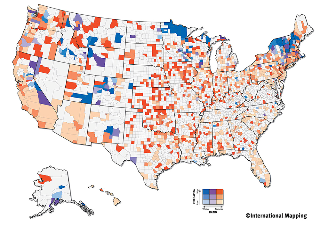
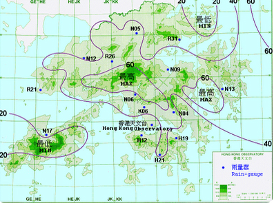
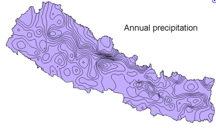
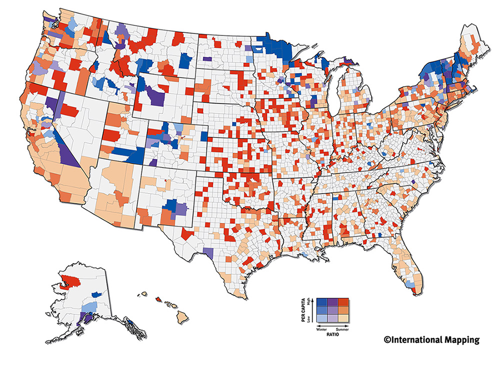
Isopleths maps is continuous distribution that show third dimensions on a map helping to simplify and generalize specific data. The third dimension is shown by a series of lines called isopleths that connect points of an equal value. The difference between the two adjacent isopleths is called the isopleth interval. These maps are common when mapping surface elevations, atmospheric pressure, amounts of perception, and other statistical elements that can be viewed as a third dimension on a map. The map above is the mean annual snow fall which helps to show the impact of the winter.

http://www.weathernotebook.org/features/winters.html

Isopach


Isopach images use contour lines in order to connect points of equal density or thickness. These images are typically used for geologically imaging, stratigraphing in sediment layers.

http://www.glossary.oilfield.slb.com/Display.cfm?Term=isopach

DRG


A DRG (digital raster graphic) is a scanned image of a U.S. geological survey topographic map. Typically USGS 7.5-minute quadrangle are the images that are scanned for DRG, but can include any raster graphic as long as it is georeferenced so the images could interlay with one another. The picture above is a DRG showing the western section of Washigton, D.C.


http://egsc.usgs.gov/isb/pubs/factsheets/fs08801.html

Wednesday, October 19, 2011

Histogram

A histogram is a bar chart that displays a variation of frequencey by being grouped together in ranges. A histogram will show us the most frequently occuring value, overall range, and the shape of the distribution.

Population Profile

A population profile displays the perecentage of people from a particular age group within that society. The younger the population the wider the population profile is on the bottom. Above is a population profile of the Philippines showing that it has large younger population. Japan for example would look almost opposite to this graph because they have a larger older population than younger.

Climograph


A climograph is graph of climatic conditions such as precipitation and temperature of a given place during a specific range of time. This specific graph above show the precipitation in inches and temperature in Fahrenheit throughout the course of a year broken up by months.


Stem and Leaf Plot

Stem and leaf plots allow you to display the statistical information by revealing its distribution, central tendency and dispersion, without losing any of the outliers. This graph above is a stem and leaf plot representing the different heights for adults.

Box Plot

A box plot is a statistical representation of data broken up to display full range of variation, staring with the minimum going up to a maximum. Also showing the IQR, the likely range of variation, and the median. The IQR is between the first quartile and the third quartile showing the interquartile range.

Wednesday, October 12, 2011

Circle Proportional Map


This circle proportional map displays seismic activity with location as well as time. This map not only uses cirlces to show seismic intensity but also graduating colors to show the different times. The different sizes of the cirlces for circle proportional maps help to indicate how strong or weak the activity is being displayed.

Choropleth Maps


I chose to use one of the choropleth maps that we were assigned to make for discussion board number seven as my map catalog choropleth map. This map is displaying the different ranges of housing prices based on location. It uses ranges/color graduated as a means of scale. On the right of my map is the scale using the different colors. Much more blues, purples, and greens are seen on this map because that is about the middle of the pricing range or about average.


Wednesday, October 5, 2011

Thematic Map


The above map describes the average population change in the U.S. from the years 1990-2000. Like the one above, thematic maps differ from general reference maps in that they show or emphasize a particular theme or special topic.

Topographic map


Topographic maps are geographic images that show elevation and depression (rise and fall) of the earth's surface. The most well known examples of Topographic maps that are most widely used are the 1:24,000-scale topographic maps, also known as 7.5-minute quadrangles. These maps were formed by the USGS in 1879 and covered the entire United State's surface.

Planimetric map


The above image is an example of the planimetric map. It is a two dimensional image showing only the horizontal position of features on the earth's surface. These may include natural physical features or man made structures such as roads or buildings. It is important to note that these maps are not topographic and are frequently in planning models such as landscape designs for urban areas.


Wednesday, September 28, 2011

Isohyet Maps


Isohyet map's like the one seen above show continuous lines which represent average similarities in rain fall amounts within particular regions. Like all Isolines, the lines on these maps represent equal variations and act as a gradating scale.

Isotachs


The Isotach lines depicts direction and speed of wind patterns. This is also one of many examples of an Isoline Map's can be used in meteorological context.

Isobars Maps


Isobars are an example of Isoline maps which show a difference in atmospheric pressure through gradating lines. The maps are most commonly used for meteorological projections and forecasts.

http://pangea.tec.selu.edu/~cboylan/etec644/weather3.html

Isoline Map


Isoline Maps are continuing lines joining the points of the same value. The different lines can pertain to temperature, wind direction, pressure, altitude. and in this particular case, annual precipitation. Isoline maps also show the phenomenon in which direction is increasing or decreasing.

Wednesday, September 21, 2011

Doppler Radar


     A Doppler radar images are used to represent velocity or frequency of an object in motion. This is done by the beaming of a microwave signal towards the desired object and measuring its reflection of that frequency. This particular Doppler radar is the weather today in Tallahassee. This image helps forecasters to explain how fast, how far, or the intensity of the precipitation is from the location, which is Tallahassee in this case.

Flow Map


This map dipicts the proposed migratory treks/parthways of early human kind. I found this map to be particulary intresting regaurding it combination of both its spacial and temporal lens. Flow Maps in general tend to represent the movement of objects from place to another. Also Flow Maps focus more on volume while maintaining a general position of the specific location.

Mental Map


     Mental maps are personal descriptions and depictions of the particular way you view and organize the space around you. To some degree all maps can be considered mental maps because of inevitable influence of the cartographer. The map above represents how a small child organizes or views the space in which he/she inhabits. 

http://designrevival24.wordpress.com/2011/06/25/understanding-place-mental-mapping/

Wednesday, September 14, 2011

Cartogram Map

http://www.treehugger.com/files/2008/11/atlas-of-the-real-world-the-planet-as-youve-never-seen-it.php

This map is a representation of a cartogram map. This cartogram depicts the world's meat consumption overall. Clearly this map is not based on per capita of meat of overall population consumption. If it were America would be by far much larger than the other countries on the map such as China. In this case since China's overall population is much larger than America's and assuming that America's per capita of meat consumption is much higher, the two country's have been skewed through this cartogram to look somewhat similar in size.