Monday, November 21, 2011

DEM


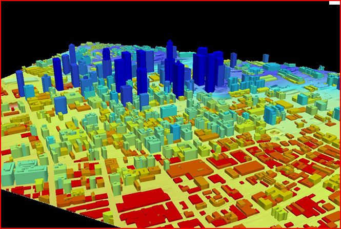
DEM stands for Digital Elevation Model, this means it is a 3-D representation of a terrains surface. This type of map generally focuses on the earth's surface and everyone that is on it, without including plants and buildings.

http://rrsg.uct.ac.za/activities/activities.html

DOQQ


Produced by the USGS, DOQQ are digital areial images that are at a resolution of one meter. This is a picture of a color infrared in 1998.

http://www.lib.ncsu.edu/gis/doqq.html

Range graded proportional circle map


There are different types of range graded proportional maps, but circle maps are the most popular. They are the most important because they are easy to construct. From a symbol standpoint, a circle is the easiest to proportion. Also cirlces are a very good visual tool used that can be very stable from a graphing point.

http://go.owu.edu/~jbkrygie/krygier_html/geog_353/geog_353_lo/geog_353_lo11.html

Accumulative line graph or Lorenz curve


A Lorenz curve is a graph showing the bottom percentage distribution in proportion to the values. Often used with economics when looking at different income distribution.


Parrallel Coordinate graph

Parallel Coordinate graphs are a common way of showing high dimensional geometry in a visual manor. A background of parallel lines is drawn to show the set of points that form a n-dimensional space.The parallel lines are normally evenly spaced and run vertical.

http://servus.itn.liu.se/smartdoc/project_results/knowledge/MD-Viewer/summary.html

Index Value Plot

An index value plot simply means to depict the relatively of all values to an indexed value.

http://jn.physiology.org/content/96/6/3323.full

Similarity Matrix

Similarity Matrix are used in sequence alignment. They are used to show the similarity of two data point within a matrix of scores. A similarity matrix has to have the following five characteristics to be classified as a matrix, squareness, non-negativity, boundedness, reflexivity, and symmetry.

http://www.biomedcentral.com/1471-2164/8/353/figure/F5?highres=y

Correlation matrix


Correlation is one of the most commonly used techniques because it is so useful. A correlation is a single number that describes the degree of the relationship between two variables. A correlation matrix computes the computes the correlation of the columns of a matrix.

http://www.sunshineprofits.com/research/precious-metals-correlations-next-step-multi-market-analysis

Star Plots

A star plot is a graphical data technique for looking at the relative behaviors of all variables in a multivariate data set. A star plots consists of a sequence of spokes, radii, each spoke representing different variables within the data set. The data length has to do with the spoke length that is also relative to the multivariate data set.

http://emdsmaps.blogspot.com/2008_07_01_archive.html

DLG

A DLG is a Digital Line Graph, this is digital vector data representing cartographic information. DLG have a wide variety of information when depicting different geographic features such as boundaries, utility lines, and roads.

http://tahoe.usgs.gov/images/4ds/dlg_zoom.gif

Hypsometric maps


A hypsometric map is a map depicting the earth's configuration. This is done by using different elevations of contour lines, shading, or tinting. Above is picture of terrain being represented by with shading of different colors of different elevations and contour lines.

http://www.izera-darksky.eu/izera/izera-en.html

Cadastral Maps

Cadastral Maps is a comprehensive register of the metes-and-bounds of real property of a country. This includes the details of ownership, GPS points, dimensions, tenure, and the value of the property. Many different countries also use this type of survey as a title register.

http://www.spaceage.co.in/cadastral-surveys.php

Cartographic animations

Animation is defined as a graphic art that occurs in time, a dynamic visual statement. Although the improvement of technology has increased the use of animation in cartography, the technique is still getting over hurtles with GIS. Temporal and non-temporal are the two types of cartographic animations.

http://maps.unomaha.edu/cartographic/animation/Temporal/TempAnim.MOV

LIDAR

LIDAR is an optical remote sensing technology that often use pulses from a laser that measure different of a target illuminating the target with light such as distance. LIDAR stands for Light Detection and Ranging, this is often used in military context.

http://www.saic.com/geospatial/modeling/lidar-urban-modeling.html

Dot Distribution Maps

A Dot distribution map is also known as a Dot Density Map, these maps use dot symbols as a visual key to portray the data. These maps rely on visual representation to show spatial pattern.

http://www.census.gov/geo/www/mapGallery/2kpopden.html

PLSS maps

PLSS maps stand for Public Land Survey System. They are used to divide and describe land in the United States. These maps divided public land domains, which is land owned by the Federal Government, this is all for the benefit of the U.S. citizens. PLSS consists of several different surveys relating to different areas.

http://nationalatlas.gov/articles/boundaries/a_plss.html

Statistical Maps


A statistical map is a map where the variation in quantity of a factor such as population are represented in a geographic form, a dot map is a type of a statistical map. The map above is representing total number of claims in different areas.

http://slabbed.wordpress.com/2008/04/06/subsidy-for-dummies-who-think-the-insurance-industry-isnt-subsidized/

Wednesday, November 16, 2011

Propaganda Maps


Propaganda Maps tend to be more artistic in order to represent and affect public opinion and emotions rather than based off data like much of the other maps within this blog. This usage of spacial representation in an artistic way of a tool of manipulation is proven to be very powerful.

Triangular Plot

Triangular Plot is an analytical application that visualizes three separate values on a diagram in the shape of a triangle with three bivariate cross plots. The normalized space is where the mean and standard deviations are calculated. Outside of the triangle diagram are the negative values.

http://www.pazsoftware.com/Ternary5.html

Scatterplot


A scatterplot is a visual representation of statistically collected and analyzed data that is projected upon an X and Y axis. These maps are typically used to gather statistical variance between different coefficients.

http://regentsprep.org/REgents/math/ALGEBRA/AD4/scatter.htm

Windrose


A windrose is a visual representation of wind intensity and direction projected upon a Cartesian north south plane.

Nominal area choropleth map


Nominal area choropleth maps are choropleths maps that visualize nominal data such as percentages and ordinal numbers over a particular spacial area.

http://my.ilstu.edu/~jrcarter/Geo204/Choro/Tom/

Standardized Choropleth Maps


Standardized Choropleth maps use the ordinal progression of various classes from a spectrum of high to low and etc. In these maps the variable measured is standardized to help provide the information in an easier way to understand.

http://www.cdc.gov/pcd/issues/2007/oct/07_0091.htm

Unstandardized choropleth maps


Unstandardized choropleth maps do not have ordered classes. The various map variables are not ranked against one another hiearchally.

http://pubs.usgs.gov/fs/2005/3051/

Univariate choropleth map


A univariate choropleth map uses one determinate variable which is visually represented through a single shading choropleth scheme; ultimately reflecting frequency of that particular variable.

Bivariate chororpleth maps


A Bivariate choropleth map uses two determining variables each with its own choropleth color gradant scheme. The overlapping of these colors sometimes makes it difficult to read the data.

http://www.directionsmag.com/images/articles/sportsillustrated/Olympic_Athletes.jpg

Wednesday, November 9, 2011

Unclassed Choropleth maps


In objection to classified choropleth maps, unclassed choropleth maps utilize a continuum shading technique to represent frequency that is not affective cartographic decision. The picture above is comparing the two different types of unclassified and classified representing the proportion of married couples.

http://gis.depaul.edu/shwang/teaching/geo381/LN9.htm

Classed Choropleth Maps


A classed Choropleth Map is when you divide data results into equal interval or frequency categories. This was used in the past to help represent different data values with minimal colors on printed maps.

http://krygier.owu.edu/krygier_html/geog_222/geog_222_lo/geog_222_lo11.html

Bilateral graph


A Bilateral Graph is graph that is dependent on two variables in order to produce its bar graph image. This image is a graph of the economic influence of the approval of the leadership in China in relation with its Asian neighbors such as Asia, Middle East/North Africa, and Sub-Saharan Africa.